Click to show/hide the code
pacman::p_load(jsonlite, tidygraph, ggraph, visNetwork, skimr, tidytext, tidyverse, knitr, widyr, igraph, plotly)With reference to Mini Challenge 3 of the VAST Challenge 2023, the task is to develop a visual analytics process to find similar businesses and group them. This analysis should focus on a business’s most important features and present those features clearly to the user.
The data set used in this exercise MC3.json was obtained from the VAST Challenge 2023 website.
In this exercise, the following R packages will be used:
tidyverse: for data cleaning and manipulation.
jsonlite: for loading and reading of the .json file.
skimr: for viewing of summary statistics of variables in the data frames.
knitr: for generating tables of the data frames.
plotly: for creating interactive charts.
ggraph: for creation of network graphs.
visNetwork: for creating interactive network graphs.
igraph: for analyzing networks
tidygraph: for graph/network manipulation.
tidytext: for text mining.
widyr: for counting and correlating word pairs.
The code chunk below uses p_load() of the pacman package to check if all the aforementioned packages are installed, and install the packages are yet to be installed. The packages are then loaded into the R environment.
pacman::p_load(jsonlite, tidygraph, ggraph, visNetwork, skimr, tidytext, tidyverse, knitr, widyr, igraph, plotly)To import the data “mc2_challenge_graph.json” file into the R environment, fromJSON() of the jsonlite package is used, as seen in the code chunk below.
mc3 <- fromJSON("data/MC3.json")The glimpse() function from the dpylr package is used to see a general overview of the data set.
mc3_edges <- as_tibble(mc3$links) %>%
  distinct() %>%
  mutate(source = as.character(source),
         target = as.character(target),
         type = as.character(type)) %>%
  group_by(source, target, type) %>%
  summarise(weights = n()) %>%
  filter(source != target) %>%
ungroup()mc3_nodes <- as_tibble(mc3$nodes) %>%
mutate(country = as.character(country),
id = as.character(id),
product_services = as.character(product_services),
revenue_omu = as.numeric(as.character(revenue_omu)),
type = as.character(type)) %>%
select(id, country, type, revenue_omu, product_services)In the code chunk below, the kable() function of the knitr package is used to examine the structure of the mc3_edges data frame.
kable(head(mc3_edges))| source | target | type | weights |
|---|---|---|---|
| 1 AS Marine sanctuary | Christina Taylor | Company Contacts | 1 |
| 1 AS Marine sanctuary | Debbie Sanders | Beneficial Owner | 1 |
| 1 Ltd. Liability Co Cargo | Angela Smith | Beneficial Owner | 1 |
| 1 S.A. de C.V. | Catherine Cox | Company Contacts | 1 |
| 1 and Sagl Forwading | Angela Mendoza | Company Contacts | 1 |
| 1 and Sagl Forwading | Christopher Watson | Beneficial Owner | 1 |
Using the skim() function of the skimr package, the summary statistics of the mc3_edges data frame are displayed as seen below.
skim(mc3_edges)| Name | mc3_edges |
| Number of rows | 24036 |
| Number of columns | 4 |
| _______________________ | |
| Column type frequency: | |
| character | 3 |
| numeric | 1 |
| ________________________ | |
| Group variables | None |
Variable type: character
| skim_variable | n_missing | complete_rate | min | max | empty | n_unique | whitespace |
|---|---|---|---|---|---|---|---|
| source | 0 | 1 | 6 | 700 | 0 | 12856 | 0 |
| target | 0 | 1 | 6 | 28 | 0 | 21265 | 0 |
| type | 0 | 1 | 16 | 16 | 0 | 2 | 0 |
Variable type: numeric
| skim_variable | n_missing | complete_rate | mean | sd | p0 | p25 | p50 | p75 | p100 | hist |
|---|---|---|---|---|---|---|---|---|---|---|
| weights | 0 | 1 | 1 | 0 | 1 | 1 | 1 | 1 | 1 | ▁▁▇▁▁ |
As seen from the report,
There are no missing values present in the data frame.
All weights are equal to 1, meaning every connection between the source and target happens only once.
There are 12,856 unique sources, 21,265 unique targets and 2 unique types.
The following plot shows the distribution of each type.
ggplot(data = mc3_edges,
            aes(x = type, fill = type)) +
  geom_bar() +
  geom_text(stat='count', aes(label=..count..), vjust=-0.3) +
  ggtitle("Distribution of types of edges") +
  xlab("Type") +
  ylab("Count") +
  theme(legend.position = "none")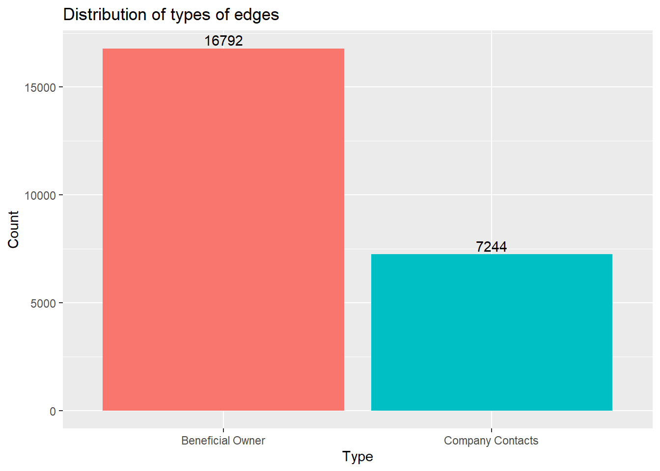
id1 <- mc3_edges %>%
  select(source) %>%
  rename(id = source)
id2 <- mc3_edges %>%
  select(target) %>%
  rename(id = target)
mc3_nodes1 <- rbind(id1, id2) %>%
  distinct() %>%
  left_join(mc3_nodes,
unmatched = "drop")mc3_graph <- tbl_graph(nodes = mc3_nodes1,
edges = mc3_edges,
directed = FALSE) %>%
mutate(betweenness_centrality = centrality_betweenness(),
closeness_centrality = centrality_closeness())mc3_graph %>%
filter(betweenness_centrality >= 100000) %>%
ggraph(layout = "fr") +
geom_edge_link(aes(alpha=0.5)) +
geom_node_point(aes(
size = betweenness_centrality,
color = closeness_centrality,
alpha = 0.5)) +
scale_size_continuous(range=c(1,10))+
theme_graph()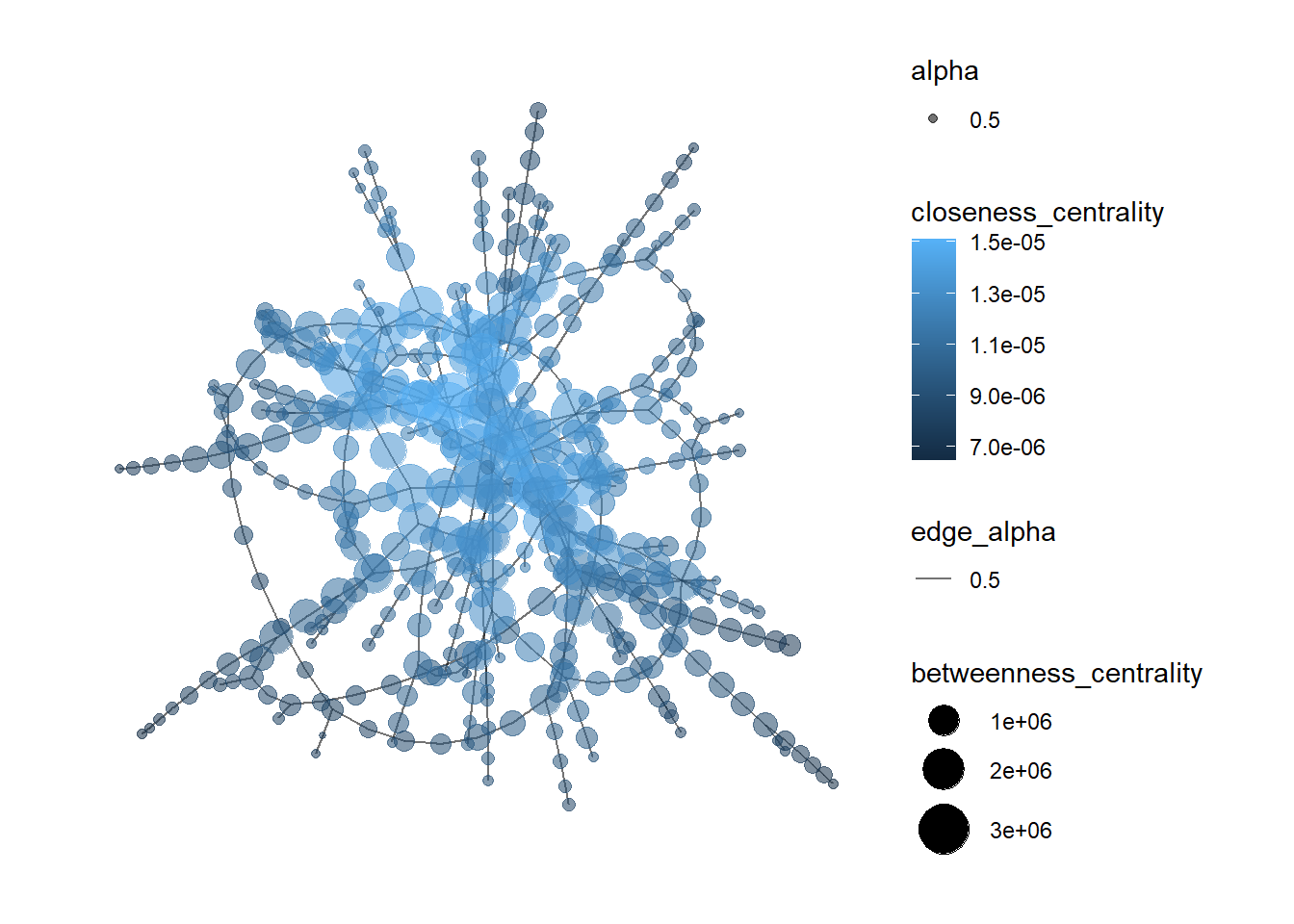
In the code chunk below, the datatable() function of the DT package is used to examine the mc3_nodes data frame.
DT::datatable(mc3_nodes,
              options = list(scrollY = "400px"))
Observations:
The code chunk below recodes rows in product_services that are Unknown or character(0) into NA.
mc3_nodes$product_services[mc3_nodes$product_services == "Unknown"] <- NA
mc3_nodes$product_services[mc3_nodes$product_services == "character(0)"] <- NAkable(tail(mc3_nodes))| id | country | type | revenue_omu | product_services |
|---|---|---|---|---|
| Macias and Sons | ZH | Company Contacts | NA | NA |
| Johnson, Lee and Rodriguez | ZH | Company Contacts | NA | NA |
| Bowman, Rollins and Griffin | ZH | Company Contacts | NA | NA |
| Hardin Group | ZH | Company Contacts | NA | NA |
| Crane, Joyce and Jennings | ZH | Company Contacts | NA | NA |
| Smith and Sons | ZH | Company Contacts | NA | NA |
Using the skim() function of the skimr package, the summary statistics of the mc3_nodes data frame are displayed as seen below.
skim(mc3_nodes)| Name | mc3_nodes |
| Number of rows | 27622 |
| Number of columns | 5 |
| _______________________ | |
| Column type frequency: | |
| character | 4 |
| numeric | 1 |
| ________________________ | |
| Group variables | None |
Variable type: character
| skim_variable | n_missing | complete_rate | min | max | empty | n_unique | whitespace |
|---|---|---|---|---|---|---|---|
| id | 0 | 1.00 | 6 | 64 | 0 | 22929 | 0 |
| country | 0 | 1.00 | 2 | 15 | 0 | 100 | 0 |
| type | 0 | 1.00 | 7 | 16 | 0 | 3 | 0 |
| product_services | 23604 | 0.15 | 4 | 1737 | 0 | 3242 | 0 |
Variable type: numeric
| skim_variable | n_missing | complete_rate | mean | sd | p0 | p25 | p50 | p75 | p100 | hist |
|---|---|---|---|---|---|---|---|---|---|---|
| revenue_omu | 21515 | 0.22 | 1822155 | 18184433 | 3652.23 | 7676.36 | 16210.68 | 48327.66 | 310612303 | ▇▁▁▁▁ |
As seen from the report,
There are 23,604 and d21,515 missing values from the product_services and revenue_omu columns. No missing values are present in the other columns.
There are 22,929 unique ids, 100 unique countries, 3 unique types and 3,244 unique product services.
The following plot shows the distribution of each type in mc3_nodes.
ggplot(data = mc3_nodes,
            aes(x = type, fill = type)) +
  geom_bar() +
  geom_text(stat='count', aes(label=..count..), vjust=-0.3) +
  ggtitle("Distribution of types of edges") +
  xlab("Type") +
  ylab("Count") +
theme(legend.position = "none") 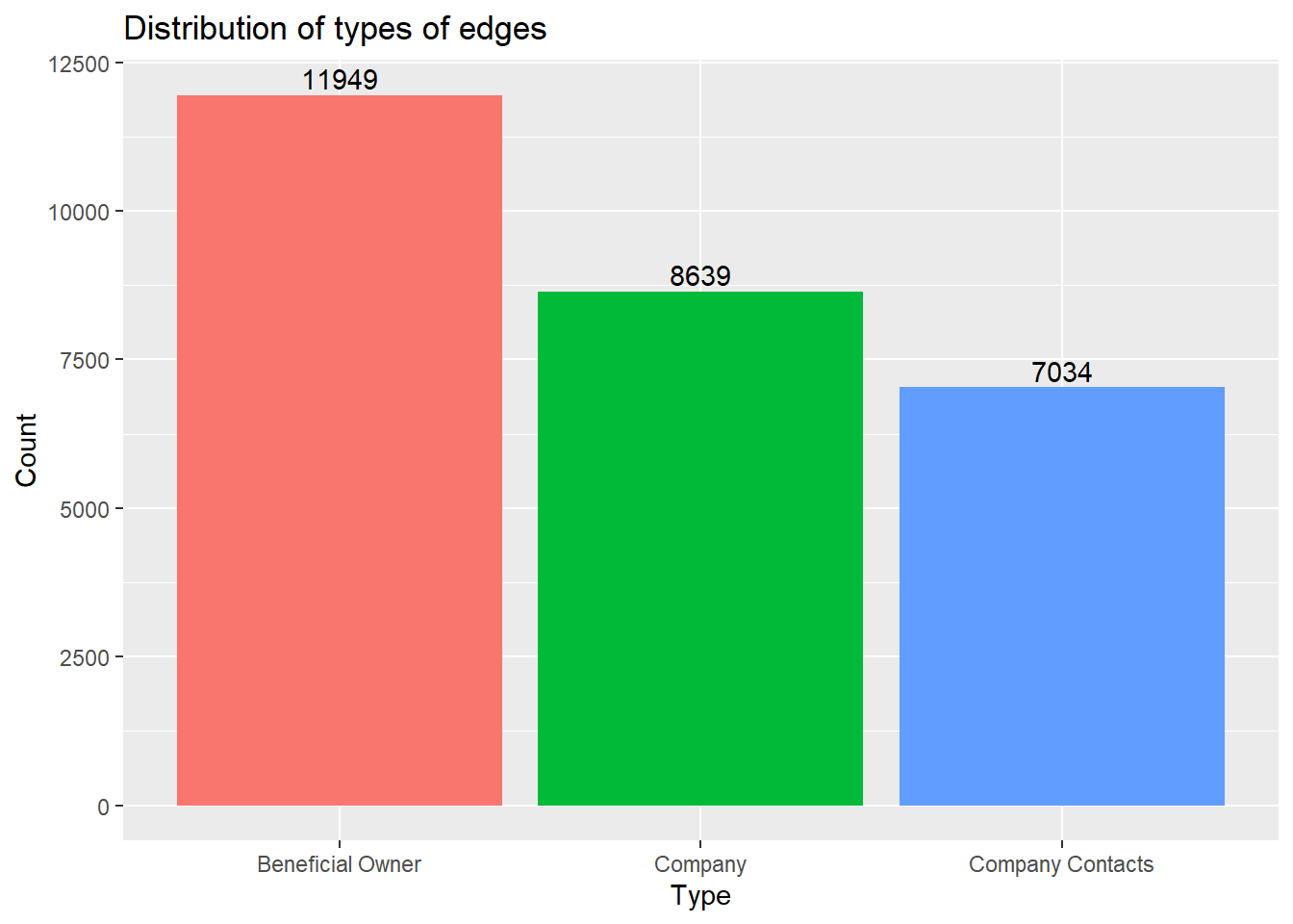
token_nodes <- mc3_nodes %>%
  unnest_tokens(word, product_services) %>% # splits text into words
filter(!grepl('[0-9]', word)) # removes numbers# plotting the top 15 word tokens
token_nodes %>%
count(word, sort = TRUE) %>%
top_n(15) %>%
mutate(word = reorder(word, n)) %>%
ggplot(aes(x = word, y = n)) +
geom_col() +
xlab(NULL) +
coord_flip() +
labs(x = "Count",
y = "Unique words",
title = "Count of unique words found in product_services field")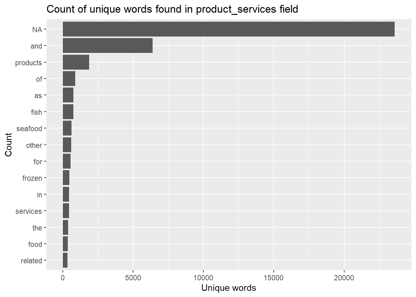
Observations:
Most of the word tokens in the list of top 15 tokens are common everyday words that do not add any meaningful information (a.k.a. stop words). These word tokens will need to be filtered out.
Missing values “NA” show up as the most common word token. These will also need to be removed.
The following code chunk removes rows that contains stop words and NA.
token_cleaned <- token_nodes %>%
  anti_join(stop_words) %>%
filter(!is.na(word))token_cleaned %>%
count(word, sort = TRUE) %>%
top_n(15) %>%
mutate(word = reorder(word, n)) %>%
ggplot(aes(x = word, y = n)) +
geom_col() +
xlab(NULL) +
coord_flip() +
labs(x = "Count",
y = "Unique words",
title = "Count of unique words found in product_services field")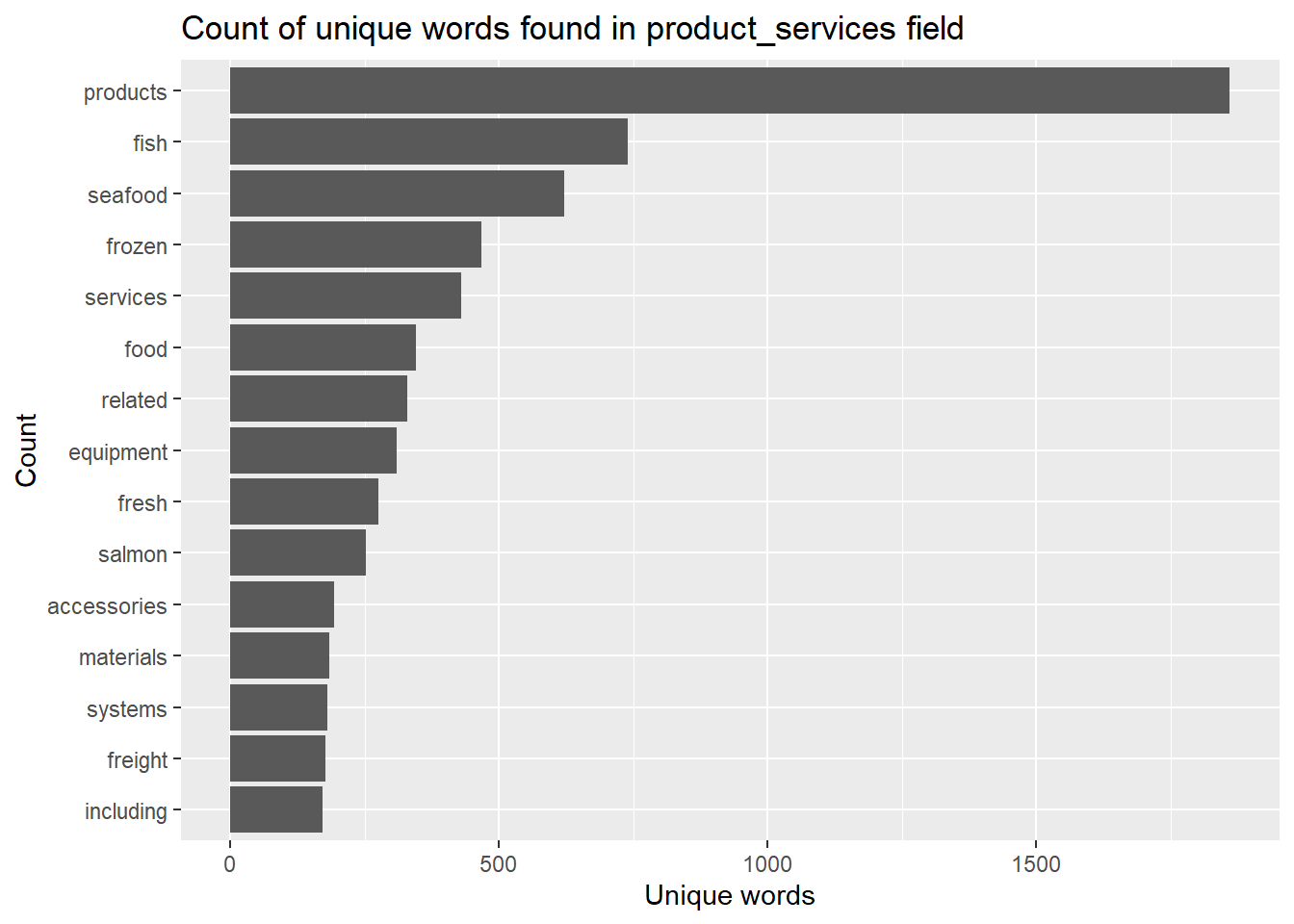
The companies will then be grouped based on similar word tokens.
Firstly, the pairwise_count() function
word_count <- token_cleaned %>%
  pairwise_count(word, id, sort = TRUE)

word_count
# A tibble: 626,690 × 3
item1 item2 n
<chr> <chr> <dbl>
1 seafood products 325
2 products seafood 325
3 fish products 321
4 products fish 321
5 seafood fish 243
6 fish seafood 243
7 related products 237
8 products related 237
9 food products 190
10 products food 190
# ℹ 626,680 more rows# preparing the data for plotting
# sort values row-wise, combine words to form word-pairs, then select only unique rows
word_joined <- data.frame(t(apply(word_count, 1, sort))) %>%
unite("items", X2:X3, sep= " + ") %>%
rename(n = X1) %>%
mutate_at(vars(n), as.integer) %>%
distinct() %>%
head(15)# plotting the top 15 word pair counts
fig <- plot_ly(data = word_joined, x = ~n, y = ~items, color = ~items, type = "bar", orientation = "h") %>%
layout(title = "Number of times each pair of items appear together",
plot_bgcolor='#e5ecf6',
showlegend = FALSE,
yaxis = list(categoryorder = "total ascending", title = "Word pairs"),
xaxis = list(title = "Count"))
figInsights:
Most of the word pairs that appear the most frequently tend to be related to fish/seafood products. This means that most of the companies likely belong to the fishing industry.
Next, we will calculate the correlation coefficient for each word pair. The closer to value is to 1, the higher the correlation is between the word pairs.
word_cors <- token_cleaned %>%
  add_count(word) %>%
  filter(n >= 30) %>%
  select(-n) %>%
  pairwise_cor(word, id, sort = TRUE)

word_cors
# A tibble: 61,256 × 3
item1 item2 correlation
<chr> <chr> <dbl>
1 researcher freelance 1
2 freelance researcher 1
3 freelance source 0.987
4 researcher source 0.987
5 source freelance 0.987
6 source researcher 0.987
7 bones scales 0.966
8 shucking scales 0.966
9 scales bones 0.966
10 shucking bones 0.966
# ℹ 61,246 more rowsword_cors <- word_cors %>%
filter(correlation > 0.6)
word_graph <- as_tbl_graph(word_cors)
word_graph# A tbl_graph: 35 nodes and 186 edges
#
# A directed simple graph with 6 components
#
# A tibble: 35 × 1
name
<chr>
1 researcher
2 freelance
3 source
4 bones
5 shucking
6 scales
# ℹ 29 more rows
#
# A tibble: 186 × 3
from to correlation
<int> <int> <dbl>
1 1 2 1
2 2 1 1
3 2 3 0.987
# ℹ 183 more rowsggraph(word_graph, layout = "fr") +
geom_edge_link(aes(edge_alpha = correlation), show.legend = FALSE) +
geom_node_point(color = "lightblue", size = 2) +
geom_node_text(aes(label = name), repel = TRUE) +
theme_graph()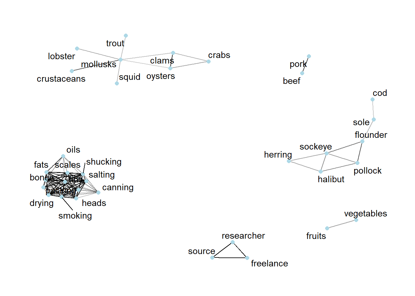
tbl_graph()nodes_df <- word_graph %>%
data.frame() %>%
mutate(id = row_number()) %>%
rename(label = name) %>%
select(id, label)tbl_graph()edges_df <- word_graph %>%
activate(edges) %>%
data.frame() %>%
rename(value = correlation)# customizing the tooltip
nodes_df$title = paste0("Word: ", nodes_df$label)
# change size of nodes based on degree centrality
nodes_df$value = degree(word_graph)
# plotting the interactive network
visNetwork(nodes_df,
edges_df,
main = "Business groups") %>%
visIgraphLayout(layout = "layout_with_fr") %>%
visOptions(highlightNearest = list(enabled = T, hover = T),
nodesIdSelection = TRUE) %>%
visLayout(randomSeed = 123)Insights:
From the interactive network graph, there are 6 different business groups. Half of these business groups are not only seafood-related, but they are also the three largest business groups.
The largest group consists of words that are preparation methods, such as packing, drying and canning. There are also parts of the fish included in this group, such as “fins”, “bones” and “scales”. Therefore, it is likely that this largest group is related to seafood processing.
The second largest group consist of mostly words that are different kinds of shellfish, such as “lobster”, “oysters” and “clams”. However, there are non-shellfish items in the group, such as “trout” and “squid”.
The third largest group are all words that are different kinds of fish, such as “sockeye”, “flounder” and “herring”. There is nothing too unusual about this group.
The other three groups are pretty small, with only 1-2 features in each group. One of the groups is related to fresh produce and includes the words “fruits” and “vegetables”. Another one of the groups is related to meat products such as “beef” and “pork”. Finally, the last business group is one related to research, and includes the words “freelance”, “research” and “source”.